1.
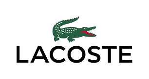
Lacoste
is a French clothing company that was established in 1933 in Troyes.
It's founder René Lacoste was a
professional tennis player and was known for his tenacity on the
court. This tenacity gave him the nickname of "The
Crocodile." This nickname inspired his
fashion brand logo that can be seen above.
The
iconic logo has big, black and bold letters to show the bold nature
of the crocodile. The black letters also show how the brand is
not aimed at any specific gender. The
crocodile is in colour so your
attention is drawn to it which is part of the reason that the logo is
so recognisable. The crocodile particularly appeals to fans of
tennis because fans of René Lacoste
will recognise the link between his
nickname and the brand. The association between Lacoste and tennis is
still around today as Lacoste is still advertised in tennis
matches.
2.

Versace
is an Italian fashion brand that are particularly associated
with selling high-end, expensive clothing. Their founder Gianni
Versace had a fascination with Greek mythology.
That is why he chose to put Medusa as the main subject of his
logo.
Medusa
is known to turn any onlookers into stone which is why Versace had
the idea to use it as his logo. He thought that it could represent
how the high-quality fashion, if seen by anyone, would stun people
with its beauty and stop them dead in their tracks.
3.
Burberry
is an English fashion brand that was founded in 1856 by Thomas
Burberry. The “Equestrian Knight” logo contains the
Latin word “Prorsum”, meaning “forwards”. As a founder and
owner of the company, Thomas Burberry was very keen and deliberate to
protect the interests of his business and products. The Burberry
logo shows an equestrian carrying a shield.
While the shield symbolises protection,
the equestrian is a symbol of pride and purity. The
black colour in the Burberry logo
represents elegance, strength and durability of the company’s
products. The black letters also show how
the brand is not aimed at any specific gender
4.
Timberland is
an American manufacturer and retailer of outdoors wear with a focus
on footwear. The brand is known for its boots which is further
supported by its name and logo. Lumberjacks are known to wear boots
that are similar to Timberland's so a clear connection can be made
between the two. Lumberjacks cut down trees which is why the logo
looks how it does. The large bold font symbolises masculinity
which Lumberjacks are generally perceived to
be, masculine. The tree could also symbolise nature
to show how the brand tries to be environmentally friendly. The
black letters also show how the brand is not aimed at any specific
gender.
5.
Hermès is
a world-renowned global French fashion company known for its high-end
leather goods, perfumes and apparel and was founded in 1837.
Originally Hermès was a saddle
manufacturer but moved into the world of fashion in 1922 when they
began to manufacture leather handbags.
The
horse-drawn carriage in the logo likely pays homage to their origin
as a company that manufactured saddles. The slanted logo and the
orange colour suggest how the brand is
different compared to a lot of other mainstream brands that are
around. The font is big which infers that Hermès is
proud about their heritage as saddle manufacturers and proud of where
they are from (Paris). The orange letters
also show how the brand is not aimed at any specific gender.
6.

The
GQ Logo are 2 very bold colours, black and red, which shows how the
magazine is a men's magazine with it's strong use of colours. The G
is red to symbolise love and passion while the Q is black to
represent class. GQ is a New York based fashion company so the
colours may symbolise how bold New York is and how classy the fashion
is. It also implies that the men in the magazines and the readers of
the magazine are bold and classy. The letters are quite think to also
emphasise boldness.
I
researched fashion logos as I felt as though I needed to understand
the content before I wrote about it

This
is the logo that I created. I gave it a modern look to draw people's
attention. It has the letters S and P joining together to show how
Synopticity Productions try to remain as close to their audience as
possible. I also made the default logo black to represent class but I
can and most likely will change to colour to acquiesce to my magazine
and E-media product's needs. I put the name of the company below the
logo as I feel that the logo itself will not tell the audience the
name of the company but I believe that in due time, it can lose the
text, similar to nike, because the logo will have become so
recognisable.
No comments:
Post a Comment