1.
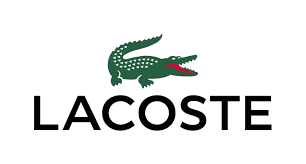
Lacoste
is a French clothing company that was established in 1933 in Troyes.
It's founder René Lacoste was a
professional tennis player and was known for his tenacity on the
court. This tenacity gave him the nickname of "The
Crocodile." This nickname inspired his
fashion brand logo that can be seen above.
The
iconic logo has big, black and bold letters to show the bold nature
of the crocodile. The black letters also show how the brand is
not aimed at any specific gender. The
crocodile is in colour so your
attention is drawn to it which is part of the reason that the logo is
so recognisable. The crocodile particularly appeals to fans of
tennis because fans of René Lacoste
will recognise the link between his
nickname and the brand. The association between Lacoste and tennis is
still around today as Lacoste is still advertised in tennis
matches.
2.

Versace
is an Italian fashion brand that are particularly associated
with selling high-end, expensive clothing. Their founder Gianni
Versace had a fascination with Greek mythology.
That is why he chose to put Medusa as the main subject of his
logo.
Medusa
is known to turn any onlookers into stone which is why Versace had
the idea to use it as his logo. He thought that it could represent
how the high-quality fashion, if seen by anyone, would stun people
with its beauty and stop them dead in their tracks.
3.
Burberry
is an English fashion brand that was founded in 1856 by Thomas
Burberry. The “Equestrian Knight” logo contains the
Latin word “Prorsum”, meaning “forwards”. As a founder and
owner of the company, Thomas Burberry was very keen and deliberate to
protect the interests of his business and products. The Burberry
logo shows an equestrian carrying a shield.
While the shield symbolises protection,
the equestrian is a symbol of pride and purity. The
black colour in the Burberry logo
represents elegance, strength and durability of the company’s
products. The black letters also show how
the brand is not aimed at any specific gender
4.
Timberland is
an American manufacturer and retailer of outdoors wear with a focus
on footwear. The brand is known for its boots which is further
supported by its name and logo. Lumberjacks are known to wear boots
that are similar to Timberland's so a clear connection can be made
between the two. Lumberjacks cut down trees which is why the logo
looks how it does. The large bold font symbolises masculinity
which Lumberjacks are generally perceived to
be, masculine. The tree could also symbolise nature
to show how the brand tries to be environmentally friendly. The
black letters also show how the brand is not aimed at any specific
gender.
5.
Hermès is
a world-renowned global French fashion company known for its high-end
leather goods, perfumes and apparel and was founded in 1837.
Originally Hermès was a saddle
manufacturer but moved into the world of fashion in 1922 when they
began to manufacture leather handbags.
The
horse-drawn carriage in the logo likely pays homage to their origin
as a company that manufactured saddles. The slanted logo and the
orange colour suggest how the brand is
different compared to a lot of other mainstream brands that are
around. The font is big which infers that Hermès is
proud about their heritage as saddle manufacturers and proud of where
they are from (Paris). The orange letters
also show how the brand is not aimed at any specific gender.
6.

The
GQ Logo are 2 very bold colours, black and red, which shows how the
magazine is a men's magazine with it's strong use of colours. The G
is red to symbolise love and passion while the Q is black to
represent class. GQ is a New York based fashion company so the
colours may symbolise how bold New York is and how classy the fashion
is. It also implies that the men in the magazines and the readers of
the magazine are bold and classy. The letters are quite think to also
emphasise boldness.
I
researched fashion logos as I felt as though I needed to understand
the content before I wrote about it

This
is the logo that I created. I gave it a modern look to draw people's
attention. It has the letters S and P joining together to show how
Synopticity Productions try to remain as close to their audience as
possible. I also made the default logo black to represent class but I
can and most likely will change to colour to acquiesce to my magazine
and E-media product's needs. I put the name of the company below the
logo as I feel that the logo itself will not tell the audience the
name of the company but I believe that in due time, it can lose the
text, similar to Nike, because the logo will have become so
recognisable.
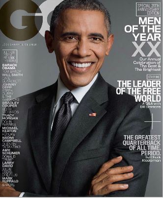
I
am analysing the special 20th Anniversary Men of the Year
edition of GQ Fashion Magazine. The front cover shows the President
of the United States, Barack Obama, standing proudly with his arms
crossed wearing a clean, dark suit. I believe that they used Barack
Obama because the magazine is an American magazine so it is only
appropriate that on the 20th Anniversary Men of the Year
edition of the magazine that they use one of the most powerful and
influential men in America, if not the World. He is standing
confidently to portray the male gender as a strong and confident
gender and to communicate that him an all of the other men that have
been up for the Man of the Year award are defiant and admirable. The
black suit that he is wearing goes with the cover and house style of
the issue. Black is also a very classy colour to promote the nature
of the fashion it promotes and the men inside. There are big names at
the left of the page to implore people to read the issue to find out
more about some of the top celebrities including the man who runs
their country, Barack Obama. Other big names at the side include
Johnny Depp, Will Smith and Bradley Cooper. Obama being on the cover
may promote how he was an ordinary person who built up to being able
to run a country and be the first ever black President of the United
states which gives the connotation that anybody can be like him, even
more so if they read GQ magazine. There is also a list of articles on
the right of the page including a quote that states “The greatest
Quarterback of all time. Period.” which may attract interest as it
is an American magazine and American football is one of the biggest,
if not the biggest, sport in the United States. Readers with an
interest in American football will be drawn because they want to see
who the 'greatest quarterback of all time' is to see if they agree or
disagree with whoever the magazine thinks it is.

There
is a 2-page spread featuring an interview with world-class basketball
star Stephen Curry. The magazine is an American magazine and
basketball is one of, if not the biggest sports in the United States.
Because he is one of the best athletes in the world, basketball fans
will want to read about him to find out more about the person they
see on the court. The black colour is consistent with the classy,
dark, house style of the issue which communicates that Curry is a
professional both on and off the court. To the left and underneath
Curry are the prices of the clothes that he is wearing. GQ is a men's
fashion magazine so people may not be interested in Curry or
basketball but like the look of what he's wearing so they want to
know the cost. Curry is shown holding the basketball close to his
chest to show that he loves and has a passion for basketball. There
is a clear audience that this particular article is supposed to
appeal to, sports fans which is why GQ has great versatility, there
are many people that the magazine could appeal to, whether it is
sports fans or men that are interested in fashion. The page isn't
covered in text, however, this issue has 262 pages so there isn't a
lack of text in the issue as a whole.

The
Vogue September UK edition has Emma Watson looking relaxed whilst
looking straight at the camera. Vogue is a women's fashion magazine
so the fact that Watson is looking straight at the camera shows how
she is strong and confident. Some media products portray women as sex
objects but Vogue tries to avoid this as they feel that women should
feel liberated instead of like objects. She is looking relaxed
instead of doing some pose that accentuates her figure, she just
looks normal, which may be why it is the popular choice of women, it
treats them like people. On the front cover it calls Watson the
“Voice of a generation” which may have something to do Watson's
sophistication and how she isn't a controversial figure in the media
like other women e.g. Miley Cyrus, Lindsay Lohan and Amanda Bynes. It
may also be because she is a young woman and many people in her
generation saw her in the Harry Potter movies which makes her more
relatable to them. I believe that this cover appeals to young women
who don't want to be what the media makes women out to be, sex
objects. The background of the image is pink to show the feminine
side of Emma Watson, the women inside and the reader.

There
is a 2-page spread of an interview with Watson that has images along
the right side. Once again the images show Watson being a normal
woman and not a sex symbol. There is a quote in the middle of the
screen talking about how she was threatened with her naked pictures
being released online which makes the reader want to know more which
means they need to read the text to find the story. A lot of text is
used in the article because of how sophisticated Vogue think the
women that read their magazine are. Watson is pictured in a suit (top
right) which shows how she is not only an actress but is valued in
other fields like how she spoke to the UN. This tells readers that
they do not have to be bound to doing one thing if they also want to
do another. It also tells them to ignore any boundaries they think
they may have.
The
GQ Fashion website has many different categories at the top of the
screen. These categories appeal to a variety of different audiences
which makes GQ a good brand. It has outstanding versatility to
different age groups. Things like 100 Most Connected and
Entertainment may appeal to younger men (12-17) while things like
Watches and MOTY (Men of the Year) may appeal to a more mature
audience (18+). The magazine is read mainly by men as shown by the
classy, dark house-style and the category about girls which portrays
them as being sex objects.

Women being portrayed as sex objects may
promote the clothes in the magazine as they can be worn by men in an
attempt to impress the sexualised women.
Although the 'Girls' section contains images of sexualised women,
there are segments in the section that may appeal to a female
audience, contrary to the magazine being aimed toward adult men.
There is a weekly 'Hottest Women of the Week' segment that not only
appeals to perverted men, but to women that want to look 'Hot' and
see what these attractive women are wearing so they think that they
too can be 'Hot' thanks to the media advertising products as making
you like the people in the adverts. There is a
search bar to allow users to find an old story that they may have
missed so instead of feeling obligated to spend all of their time on
the site, they can just search for an old story/issue that they may
have missed for whatever reason. Even the most committed readers may
have other obligations
The
magazine isn't slow to jump on current events which may instill trust
in its readers as GQ being a reliable news source. It also gives the
viewer incentive to revisit the website so they can keep updated on
what is going on in the world which may inspire them to
begin/continue reading the magazine. Segments like 'Watch of the
Week' and 'Hottest Women of the Week' promote repeat viewing of the
website as they are frequently updated and gives the viewer a
different experience each time. The
website advertises a subscription to the magazine with 'FREE digital
editions' which may make the viewer feel as though they have received
a special offer for visiting the website which may convince them to
subscribe. The fact that the website advertises the magazine that it
is based on gives the viewer a sense of the magazine's content being
endless which means that it can acquiesce to the the viewer's needs
which makes the audience grow, making the company more-and-more
successful than it already was. Although the magazine is aimed toward
a younger adult audience, the magazine has a 'Watches' section which
appeals to an older audience as they care more about accessories than
the younger audience that would read the magazines which makes the
magazine appeal to several different audiences. The magazine is
clearly for an adult audience because of the sexualised women and the
whole column based on sex where readers submit questions to be
answered by the magazine's 'Oracle' which also makes the magazine
interactive, people actually submit things to ask one of the
employees to be published in the magazine. The site is also
interactive as readers can vote for their 'Best Dressed Man 2016'
which makes the reader feel involved with the magazine and like their
opinions matter.

The
website advertises the latest issue of the magazine which shows has
Harrison Ford on the cover which is very relevant to today's pop
culture because of Star Wars: The Force Awakens being in UK cinemas
on 17/12/2015.

The
Vogue website is clearly aimed towards women as it shows them as
strong, liberated people rather than sex objects like GQ does. I
feel that because of GQ's sexualised image of women, they will prefer
to read Vogue as it clearly treats women with respect. All of the
images on the homepage are of women to show that they are clearly the
target audience.

The
sidebars are also clearly aimed towards women with things like
'Beauty' and 'Miss Vogue' being there. The audience of Vogue is
nowhere near close to the audience that GQ has in terms of
versatility. However they have a solid target audience (young adult
and adult women) which promotes loyalty in their fanbase.

Similar
to GQ, Vogue prides itself on keeping readers up-to-date with the
social news. As you can see through the time stamps, there is little
time between the publishing of the articles so there is always
something different for the reader to read. Vogue is also advertised
as being available on 'iPad, Kindle or laptop' as well as a physical
copy to tell readers that their product is portable which may
convince them to download the latest issue on one of these devices
(provided the reader has one). At the top of the screen there is a
trending bar to tell the reader about things that are popular in
their magazine at that moment in time and to save them the hassle of
having to look all over their website to find a story that is trending. There
is a search bar to allow users to find an old story that they may
have missed so instead of feeling obligated to spend all of their
time on the site, they can just search for an old story/issue that
they may have missed for whatever reason. Even the most committed
readers may have other obligations.
There
is also a whole column on fashion trends so that any reader can keep
ahead of today's fashion. Vogue is also interactive as there is a
Taylor Swift quiz on their homepage because of her birthday on
20/12/2015.

Taylor
Swift is a celebrity that has been famous from quite a young age so
people that listen to Taylor Swift may accept the challenge to answer
all the questions correctly. Taylor Swift appeals to women because
she is a woman, and because she writes songs about breaking up with
men and getting over them which once again shows how women are
portrayed as strong and independent by the magazine.
This
research has helped me to develop an understanding of how to appeal
to whichever audience I end up selecting with my magazine and E-media
product. I feel that I now know what appeals to different audiences.
I now also have an understanding of how to structure my magazine and
E-media product depending on my audience. If I have faith in the fact
that my readers are intellectual, like Vogue, I will have more text
for them to read compared to if I had little faith in their
intellect, like GQ. I have also learned how to make people re-visit
and re-use my magazine and/or E-media product. I can assure the
audience that there will be constant updates by having segments and
columns like 'of the Week'. I can also use a news feed in my E-media
product to give the audience more incentive to revisit my product and
stay ahead of the social news. I have also learned that I can make my
magazine and E-media product interactive and get viewers to do
something like send in questions or take a test/quiz.