Thursday, 12 November 2015
Wednesday, 11 November 2015
Magazine Writing (Unfinished)
Hack
of the Week:
Did
you happen to see Justin Bieber roaming the streets of LA last
weekend? Well, either way, he's inspired this week’s Hack of the
Week! *Applause* In case you missed the last Knot Cool HOTW, we did a
segment on how to turn shoelaces into, cool, unique and interesting
wristbands. This can be found on our website at www.KnotCool.co.uk if
you weren't fortunate enough to read it.
This week, our hack is to do with something I hope we all wear, Jeans. A shoelace can be a modern and improved take on a belt. Between you and me, I like it because you can use colours that contrast/clash and not look like a crazy person! This lace is tied just like the typical lace in your shoe but I prefer a typical bow/bunny ears tie, however, you can adapt it to whatever suits you.
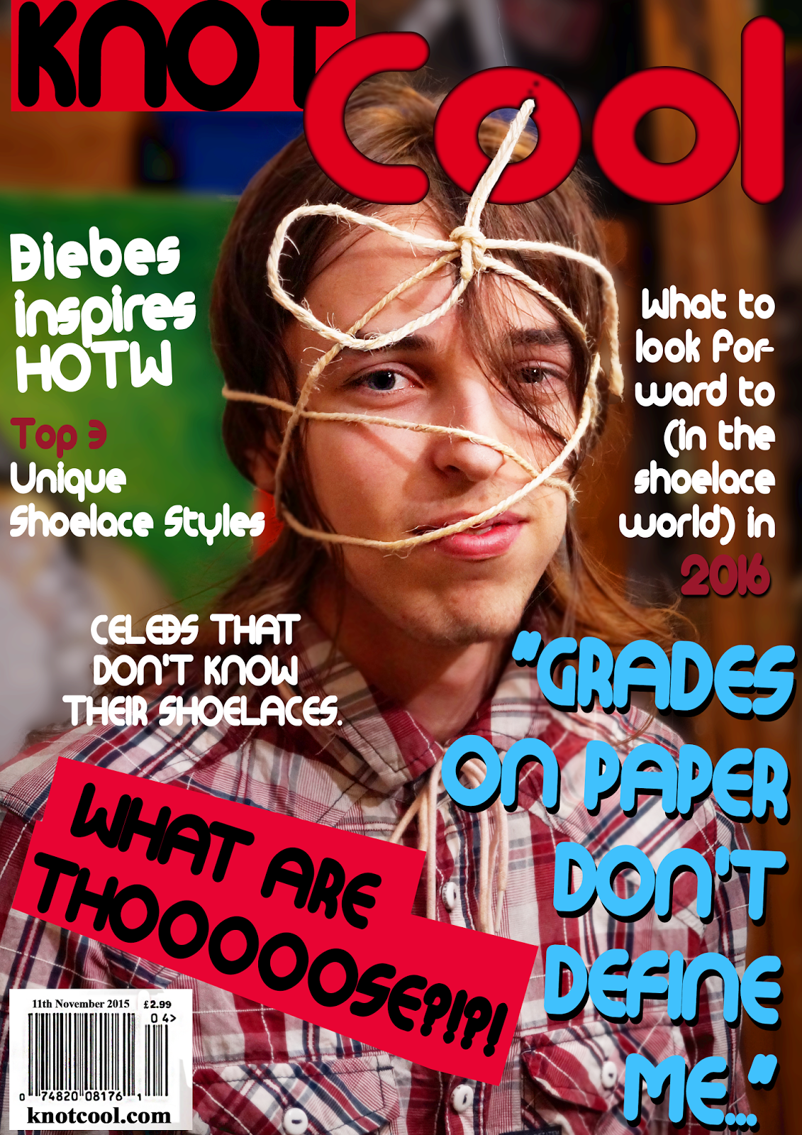
Top
3 Unique Shoelace Styles
3.
The Loop Back
The
Loop Back is a cool style where the laces loop back in on themselves
giving it that real unconventional look. It is simple, yet effective
and can really make bi-colour laces look amazing. The look is best
with one of the most popular kinds of shoe there is, the sneaker
which means that it is not only easy to do but you likely own a pair
to do it with which puts it at number 3 on our list. If you would
like to learn how to create this style, just follow the diagram
(below)
2.
The Star
Now
isn't this a look. If you want to completely break the walls of
convention down, go for The Star. This look is for the person that
can't stand being the same as everybody else. The look coincides
amazingly with converse shoes thanks the iconic Converse (star) logo.
In theory it may sound strange but just look at the results, it is a
spectacle and is worth some attention. The look is probably the
difficult of the lot but seeing the results, surely you can put in a
little extra time and effort. If you would like to know how to create
this look, just follow the diagram below.
1.
The Hidden Knot
The
Hidden Knot takes the cake in this countdown with its plain, yet
effective look. For those that are uninterested in seeing knots in
their shoelaces, this is the lace for you (if not, consult number 3
or number 2). This lace goes the best with Skate Shoes in our opinion
but that does not devalue the lace, it can be used with practically
style of shoe (provided it has laces of course). This is the more
complex of the 3 but if pulled off correctly can look absolutely
stunning, just follow the diagram (below).
We hope that you can find the kind of lace that you enjoy which defines you as an individual.
Giorgio Rigioni is one of the most prodigious talents in art today. He was born in Turin to an Italian father and English mother. He had always been fond of art and used to create art to pass the time. With his father being a clothes manufacturer, he was keen to create still-life pieces. At the age of 12, Giorgio developed a particular interest in creating artwork of shoes. He attended Liceo Vittoria (High School Victory) to do his A-Levels. Rigioni however would disrespect teachers and truant lessons because he was already confident enough that he would pass his exams. While the method may be undesirable, he did pass with flying colours in art. Rigioni has since moved to England as his work is being shown in the Birmingham Museum & Art Gallery. We had the privilege to interview Region.
Can you remember how you felt when you saw your piece in the gallery for the first time?
“When I got the saw it there for the first time I felt like a celebrity but then I realised, being a celebrity is about being distant but art is about being close to people, so no, I didn't feel like a celebrity, I felt like a true artist, like my work had an audience of people that feel like my work reached out to them."
You have been dubbed many times as being the next Andy Warhol, what are your thoughts on that?
"Of course I'm honoured because Andy was one of the greats. I don't think I'm quite at his level yet but I can get there eventually, maybe I need a bit of madness like he had(...) Andy was a fantastic artist but I don't think I want to be the 'next' anybody. I want to be the first me.”
When you're not creating Art, what do you do? You're still young.
Honestly nothing too special: I like listing to house music (Diplo, Avicii all of that kinda stuff); I like my internet, my Twitter handle's '@GiorgRigioniART' and my instagram's the same; I love YouTube videos, I prefer people like PewDiePie, Smosh, Nigahiga, all of those kinds of videos.
What would you say your muse is, your art's influence?
"Well, growing up in Turin my dad was a clothes manufacturer and he always used to show me the kinds of clothes he made, I always preferred the shoes I think it's because all parts of a shoe are vital, a shirt without a button is still a shirt, however, take any part away from a shoe and it no longer functions as a shoe."
Rumour has it you were a bad student at school, care to elaborate?
“Grades on paper don't define me, paint on paper defines me, maybe I was a bad student but I was a prodigy, my methods may have been wrong but I had that exam passed from the moment I joined Liceo Vittoria and if anybody tries to say otherwise, they're lying."
Giorgio plans to start selling his art and donate any profit towards clothes for needy African people. If you would like to see/buy some of Giorgio's art, you can visit his website at www.GiorgioRigioniArte.it.
Sunday, 18 October 2015
Fashion Brand Logo Analysis
1.
Lacoste
is a French clothing company that was established in 1933 in Troyes.
It's founder René Lacoste was a
professional tennis player and was known for his tenacity on the
court. This tenacity gave him the nickname of "The
Crocodile." This nickname inspired his
fashion brand logo that can be seen above.
The
iconic logo has big, black and bold letters to show the bold nature
of the crocodile. The black letters also show how the brand is
not aimed at any specific gender. The
crocodile is in colour so your
attention is drawn to it which is part of the reason that the logo is
so recognisable. The crocodile particularly appeals to fans of
tennis because fans of René Lacoste
will recognise the link between his
nickname and the brand. The association between Lacoste and tennis is
still around today as Lacoste is still advertised in tennis
matches.
2.
Versace
is an Italian fashion brand that are particularly associated
with selling high-end, expensive clothing. Their founder Gianni
Versace had a fascination with Greek mythology.
That is why he chose to put Medusa as the main subject of his
logo.
Medusa
is known to turn any onlookers into stone which is why Versace had
the idea to use it as his logo. He thought that it could represent
how the high-quality fashion, if seen by anyone, would stun people
with its beauty and stop them dead in their tracks.
3.
Burberry
is an English fashion brand that was founded in 1856 by Thomas
Burberry. The “Equestrian Knight” logo contains the
Latin word “Prorsum”, meaning “forwards”. As a founder and
owner of the company, Thomas Burberry was very keen and deliberate to
protect the interests of his business and products. The Burberry
logo shows an equestrian carrying a shield.
While the shield symbolises protection,
the equestrian is a symbol of pride and purity. The
black colour in the Burberry logo
represents elegance, strength and durability of the company’s
products. The black letters also show how
the brand is not aimed at any specific gender
4.
Timberland is
an American manufacturer and retailer of outdoors wear with a focus
on footwear. The brand is known for its boots which is further
supported by its name and logo. Lumberjacks are known to wear boots
that are similar to Timberland's so a clear connection can be made
between the two. Lumberjacks cut down trees which is why the logo
looks how it does. The large bold font symbolises masculinity
which Lumberjacks are generally perceived to
be, masculine. The tree could also symbolise nature
to show how the brand tries to be environmentally friendly. The
black letters also show how the brand is not aimed at any specific
gender.
5.
Hermès is
a world-renowned global French fashion company known for its high-end
leather goods, perfumes and apparel and was founded in 1837.
Originally Hermès was a saddle
manufacturer but moved into the world of fashion in 1922 when they
began to manufacture leather handbags.
The
horse-drawn carriage in the logo likely pays homage to their origin
as a company that manufactured saddles. The slanted logo and the
orange colour suggest how the brand is
different compared to a lot of other mainstream brands that are
around. The font is big which infers that Hermès is
proud about their heritage as saddle manufacturers and proud of where
they are from (Paris). The orange letters
also show how the brand is not aimed at any specific gender.
6.
The
GQ Logo are 2 very bold colours, black and red, which shows how the
magazine is a men's magazine with it's strong use of colours. The G
is red to symbolise love and passion while the Q is black to
represent class. GQ is a New York based fashion company so the
colours may symbolise how bold New York is and how classy the fashion
is. It also implies that the men in the magazines and the readers of
the magazine are bold and classy. The letters are quite think to also
emphasise boldness.
I
researched fashion logos as I felt as though I needed to understand
the content before I wrote about it
This
is the logo that I created. I gave it a modern look to draw people's
attention. It has the letters S and P joining together to show how
Synopticity Productions try to remain as close to their audience as
possible. I also made the default logo black to represent class but I
can and most likely will change to colour to acquiesce to my magazine
and E-media product's needs. I put the name of the company below the
logo as I feel that the logo itself will not tell the audience the
name of the company but I believe that in due time, it can lose the
text, similar to nike, because the logo will have become so
recognisable.
Thursday, 8 October 2015
Tuesday, 22 September 2015
Sunday, 20 September 2015
Subscribe to:
Posts (Atom)